Monday, March 20, 2017

Pit Fire

  1. Explain the process of pit fired ceramics and saggars.  Should be at least 3 sentences or more (20pts)
First you have to make a sketch and choose what technique you'll use to make it. After that, and once you make it, you have to fire it in the kiln. Prior to the firing you have to make sure that you smooth it out best you can (using a spoon). After the firing, fix anything by sanding it, and then begin the actual pit fire. Wrap your piece in flammable items and drizzle chemicals all throughout it, then place the pieces in a pit and light it on fire. Hopefully the flame doesn't blow up and destroy your piece, but ya know, sometime fires are LIT.
  1. How do you feel your piece was successful and how might you change it if you were to make it again? (20pts)
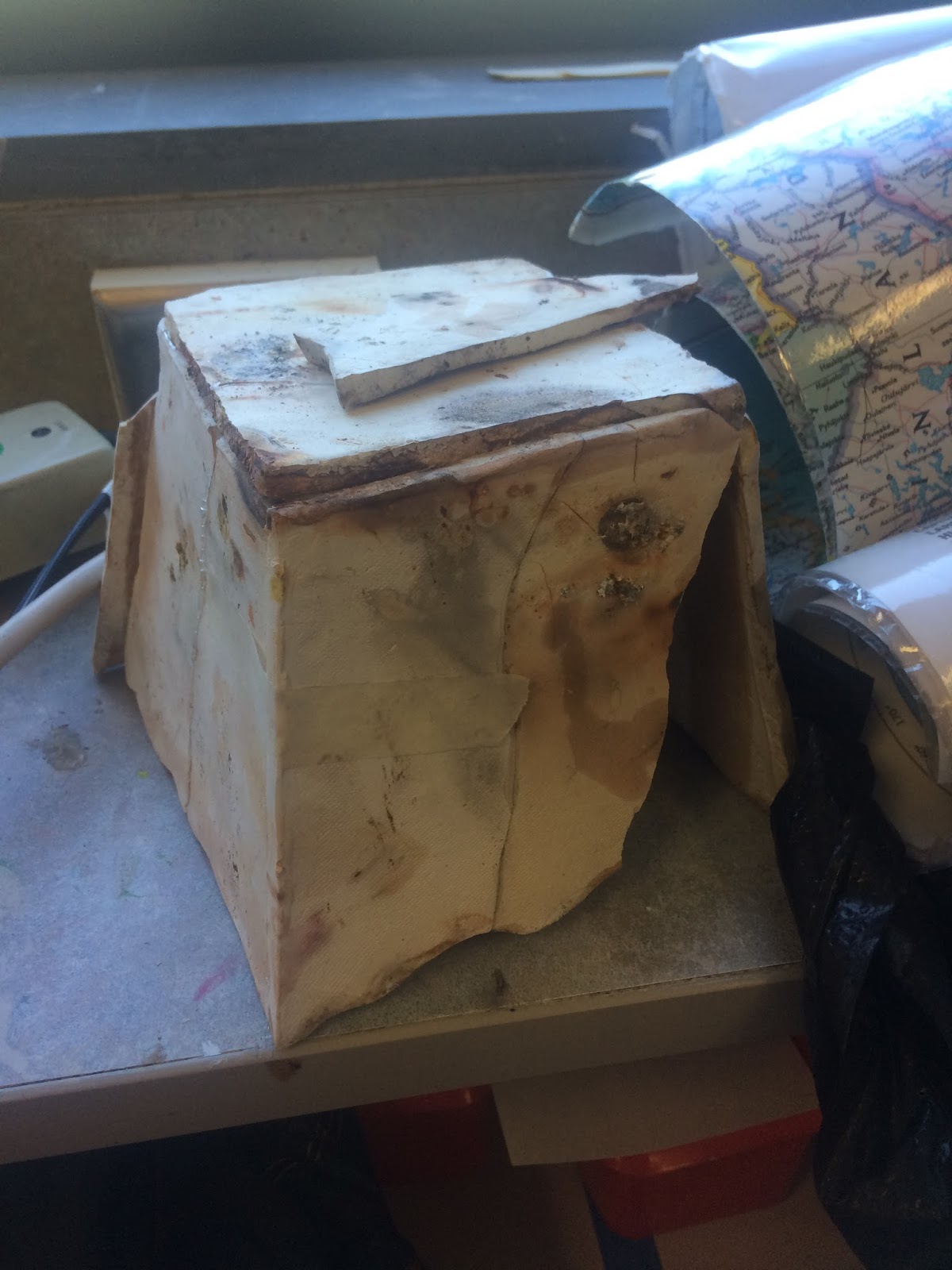
No I feel like my piece failed terribly. However, I thought the structure of the piece was good, I'm proud how it turned out because it was pretty challenging for me. Though I worked hard on the actual piece, I think I could have improved on the integrity; the scratch and slip wasn't that good which is what probably added to the incredible break in the piece. 


Thursday, February 16, 2017

Learning Techniques


What technique do you think you'll use for your pit fire piece?

I'll probably use slab. Though I think coil would actually end up being easier since I feel like you can have more mistakes and still be able to fix it, slab will end up looking more like what I hope for than coil. (pinch is irrelevant) 

Who did what in the group?  How was the work divided?

Mark and I were a "group". I did the directions and writing, and Mark did the pictures. 


Thursday, February 9, 2017

Relief


1. I think what was most successful pertaining to the cardboard piece was the ability to add the layers and dimension, and pairing that with such little paint to still make something that isn't realistic but "detailed". I think the tile piece low key looks gross BUT what was most successful was the fact that since this has really been my first sculpture in years, I was able to add all the elements needed (texture, glaze, glass, relief) with little to no hiccups in the process; so though it looks bad, the actual process was not.

2. I probably would have changed the theme of the tile piece. I still like what I was going for but at my skill level and the size that we were working with, it wasn't realistic for myself to create what I was hoping for. A theme like space or something to do with rain is more my wheelhouse and has more interest to me. 

3. My subject for the cardboard was the ocean. I chose this because I figured it would be easy to include the layering and different textures since the actual ocean itself has so many different levels. Also one of my favourite art pieces is "The Great Wave off Kanagawa " so it was something I really like in art works and have seen often. For the tile piece I was going for the abstract vibe; the ocean, ground, and sun. I was hoping it would bring together multiple parts of nature and kind of the view of the sunrise near the ocean. I chose that because when someone says nature it's kind of the first thing I think of, so I went with it. 

Sunday, January 29, 2017

Inspired Artist Post (Feb 1)


   My chosen artist is Dustin Yellin ( http://dustinyellin.com/ ). He's currently 41 years of age and lives in Brooklyn, NY. So his artworks are generally a little tricky to describe, but basically he works in glass. He tends to build on the idea of layering, to create a 3D sculpture, but it'll emerge with often an incredibly amount of detail since each layer has some sort of image on it. He grew up in Colorado, but didn't feel that school was doing much good, so veered off the normal path. He studied for a year with a physics teacher; this surrounded him with the scientific approaches on matters and generally eccentric stuff (that's code word for hallucinogens).
   Alrighty, so to be completely honest I chose him because it was one of the first pictures that popped up that seemed cool. Now for me, for art to really be cool it has to fit my 'cool art checklist'. This means the following: would I not question why it's in an art museum? would I actually stop and look at it or would I slowly walk past nodding because I feel like people will think I'm ill-cultured if I don't pretend I'm interested? If this showed up on my pinterest board, would I re-pin it? Well his sculptures check these all off (I'm gonna look him up on pinterest after this assignment in fact). I think what really got me to stop scrolling was that I had to stop. His pieces are so incredibly detailed and are multiple art works in one; you have to really look at it to get the whole picture. Also, after I decided he's the guy for me, I found out he did a piece for the New York City Ballet, which is my wheel house. So to sum this up: I could justify why he's famous, I love things that can always show you something you hadn't seen before, and he did something ballet oriented so of course I love it.
NYCB Art Series Presents Dustin Yellin

Thursday, January 26, 2017

Texture


                         Cloud:

What was hardest about the cloud texture was making it look soft and fluffy. I normally would rely more on the coloring aspect of an art form to shape it (ha pun intended) into what I want, but making it resemble a cloud when it's grey and dense purely from texture was pretty tough.


                          Rock:


What was hardest about the rock texture what getting some parts of it really rough looking but also really smooth and curvy. It was hard to do with the clay and really separate the two looks without it turning into more of a blob feel.


                        Fur:


Obviously I struggled the most with the fur. I just had a generally tough time. I don't really have a good grasp on how to physically mimic fur and things like hair; fine (lol another pun like fine hair) and detailed things. Also what was weird about this one was the angle that we were trying to create; looking from a birds eye view was throwing me off even more than it would have if I were to just recreate the look of fur.

Wednesday, June 4, 2014

Art Journal

Did you try something that you weren’t sure about as part of this project?
 Yes. I'm not use to the layering of the materials that I used. Using oil pastels over the paper that was glued down was really weird. Also, not only using the one, also having marker blended in is really odd because I normally don't mix things like that.

Did you pick a material or technique that was new or different over something that was familiar?
   Yes. I decided to layer with multiple things like I said before. I wanted to just stick with one and figured I could just add a ton of detail so it seemed busy and creative and all that jazz. Instead I used many things and tested it out.

What is this artwork intended to say?
(lets get deep here)   It's suppose to be for the word grow. It's meant so kind of show nature and how it's always growing and how humans strive for such a thing. From the beginning we want to grow, grow taller, grow mature, grow older, always growing. While nature constantly grows at its own pace, we become adults in only 18 years legally, and even when we're old and society see's those as frail and done with growing, nature still grows on taller and bigger, far more than any human could ever be. I hope it subconsciously would bring the thought of us wanting that,  that's a piece of why we love nature, it's a constant growing thing that's always there throughout our short life of 'growing'.

What issues are you examining through your artwork?
   *sigh* Basically exactly what I said before. That we rush growing up from such an early age, and we should take a lesson from nature. The lesson to just grow as it comes and not to force something that the world doesn't force.

How is this artwork about who you are or what you like?
    I like nature and a lot of different colors which I showed in this piece.

Nature Art

How did you use your own unique ideas in your work?
   We did multiple different colors and there was no pattern to it. Not all the color blocks were the same size or next to the same color as it was before. I tried to make it as colorful and bright as possible, putting warm colors next to cool colors and darks next to brights.

Did you use a source for inspiration, then combine it with your own ideas to make it original?
   Yes. The source was the stereotypical yarn bombing. Yarn bombing is often seen when the yarn is crocheted and then wrapped around the tree. We used this as an idea for the subject and what we should actually do. Instead of crochet, we just wrapped yarn tightly with as little gaps as possible. 

  How did you respond to challenges that occurred as you worked? 
     We just worked around them. For example when there were tiny branches/leafs we would just wrap around the branch. Also another example is the gaps, we would look and see that we left gaps so we would just re-wrap a few times until it got covered. 

Did your work take an unexpected turn due to a mistake or did something happen that was unplanned?
  No. Though we had some obstacles, we tried to stay as close as we planned as possible. If there were gaps we would re-wrap or weave it through the gaps. If there were branches we merely went around them. We tried to make it look like exactly how we hoped.